The changes I'm suggesting fall into four main categories:
Walls
Lighting
Furniture
Accessories
You'll be surprised at how much you can do with a paintbrush and acceptance of the fact that less really is more -
Walls
A major change that will occur in your house is after you paint. Start by the basic, how do you want your room to look? Bright, Colourful, Pale, Pastel? What colour will match the shade of your floor and furniture? Test some colors in different lights. Experiment.Do not be scared to try something new. The White Loop Quarters project I worked with, needed light, lots of it. It has a low ceiling and maroon flooring which made it look smaller despite a good room size.
Lighting

Just like you wear a beautiful necklace to accentuate your dress, lighting makes whatever else you have on look even better. It transforms the place and brings in warmth. Dim spots in the room can be highlighted with standing lamps. In this room I wanted to make it look cozy yet bright hence standing white lamp against the yellow walls gave a gentle glow to the room.
Furniture

One of the important elements of re-doing space is furniture. The living room had too many subtle tones of yellow, brown and white. I needed to perk it up yet, not pick anything too bold which would make the room look smaller. Hence the sofas were designed and made with teak wood and turquoise polka dots upholstery. We threw pink cushions on it to give a slight splash of colour.

A slender 'L' shaped coffee table was made which essentially consumed less space and a taller side table was fixed in the corner to add interest and scale. The room felt clean and roomy. Such an obscure piece of furniture, sometimes, does the deal!

A tall pane-like entertainment centre was placed diagonally with the wall. It served a purpose of a divider between the living and dinning area and it concealed the clutter. No place in the middle of the room could be allocated to accommodate the TV and its accessories since it could kill the perception of space. Hence an odd wall was picked to showcase the same.
Accessories


Pillows, pots, lamps.....flowers, etc add visual interest and substance. Accessories are both a blessing and a curse. This living room benefits from the bold pink pillows on the turquoise blue sofas.

Another accessory is the mantle or shelf fixed on the wall. Framed by red vases, and stripped of clutter, the mantle looks clean and dramatic.

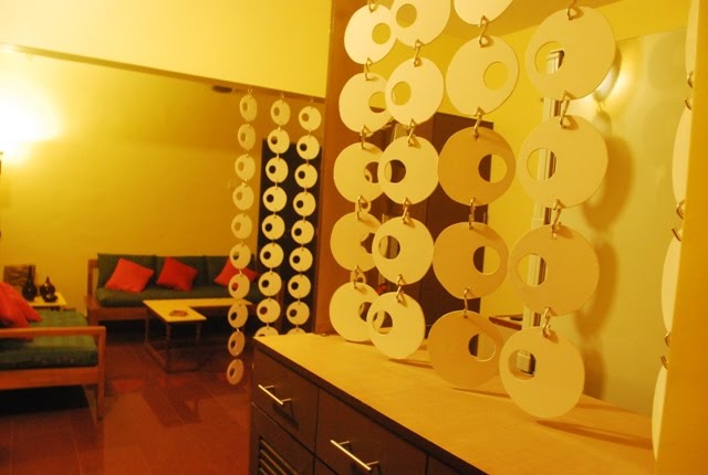
One of the real focal points for the room is the White Loop divider! The huge room had to be segregated into two - living and the dinning. White, cascading loops being the pattern, stole the show! It gave a punch to the room and yet did its job of partial separation!

What you are is what your home is....isn't it? Hence, with the 4 fundamentals of Wall, Light, Furniture & Accessories, this space was converted into a serene, cozy, warm and a welcoming quarter.
Nice post ... love what you have done with the 'loops' ... Great work ... Must stop by your studio the next time we are Pune.
ReplyDeleteAlso wanted to let you know that the Badge for http://www.lively-wood.com is not working.
Cheers,
Madhu
http://www.10yearitch.com
Nice, Sonia!! Ryan and I are redecorating our place and this is very helpful and inspiring :-) I needed some new ideas!
ReplyDeleteHi Madhu: Thank you so much. Yes, please do stop by.
ReplyDeleteThere was some problem with Blogger and hence couldn't even see your comments. I guess its fixed now. Thank you for informing me!
Romina! Sure...take what you like! :)
Sonia, you have a nice blog. I really liked your living room especially the room divider:)
ReplyDeleteThank you Neha, you blog is very good too. I especially liked the Cozy Corner!
ReplyDeleteHi Sonia
ReplyDeleteCompliments on the Bandra exhibition and also on this particular piece specially, very inspiring and informative..i especially liked your idea for that right-angled table..it is so very convenient and aesthetic...keep up the good work...will catch up with you soon...
Best wishes
Parvez
Wordsmith Enterprises, Mumbai
Hello Parvez, Thank you so much for stopping by and appreciating my work. Yes for a small living space, the table works out great. Hope to meet you soon.
ReplyDeleteSonia
Interesting design. And nice lighting.
ReplyDeleteHello i want to tell you that your blog is looking so good.
ReplyDeleteI got so many interesting information which i liked the most.
Thanks for sharing this with us./