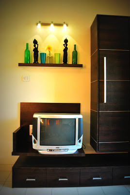
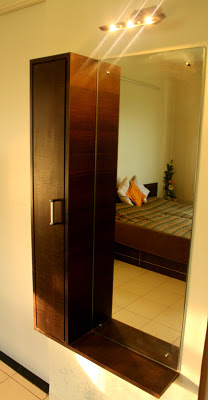
Now let me start making by making the title clear. When I say Teacher’s Philosophy, I simply mean the way a teacher thinks. The family are a bunch of extraordinary teachers. When I worked with Mrs. Bhupatkar, I was surprised to see how careful and observant she was. She didn’t miss out a single detail when it came to little things like handles, curtains, her picture frames, to the extent of switch boards! The first time I met her, she made it clear that she wanted something in straight lines, and it all had to look clean! That’s when I knew she wanted to go contemporary in her room.


Whites & greens, basic and minimalistic was her choice. Long curtains, patterned bedspread and bold pillows made her happy. We refurbished the existing wardrobes and built a little entertainment centre for her antique TV.


Since all members of this family are ardent readers, creating a corner where they can unwind was important. The advantage of working in this house was that the rooms are good sized. I did get a nice cosy corner to change the focus of the bedroom, which was previously unattended.

Well to my good fortune, they owned a 100 year old antique gorgeously made chair with an even better old trunk lying around. They certainly valued it but really didn’t know how it could be incorporated into their home. When I suggested it’s place, they were truly delighted and happy that these antiques could be a part of their decor. So, this unattended corner became a reader’s haven. I placed good amount of lighting behind it with a few abstract shelves which made the room look cool and contemporary with a splash of the old.

Lastly, I did want to provide a little dressing area. Even though reading was a highlight of the room, I didn’t want to forget that it was after all a bedroom. In a small space beside the bathroom, just on your way out, a simple peek-a-boo mirror cabinet was fixed.
Hence ending the story of the Teachers’ Philosophy, keeping it straight and simple!
Now let us talk about the eccentric dancers’ delight. My friend, who is an outstanding dancer, wanted her room to be eclectic and on one hand and on the other wanted to bring some form of dance into the decor. So let me start by explaining how we went about doing it.
The corner of this spacious bedroom was a bit neglected. I knew not much could be done with it since accessibility to the corner wasn’t convenient. But without doubt, I could make it a focal point of the room and yet give some functionality to it. Hence, we hung some kandeels or lamps from the ceiling and arranged a beautiful old cabinet to display her Natraj (God of dance) statue on it. The lower cabinets could be used to store her books and other brass items. The cabinet was refurbished and glass was put on 2 sides to showcase her collection of antiques.

The next very important part of her room was her beautiful dresser named Surya. We scrubbed and rubbed to make it look old, frayed and antique. The contrast of yellows and blues with ornate brass handles made the corner look brilliantly distinctive. Since that little dance element had to be added, hand-made handles with ghoongroos or bells were installed on the drawers. We also added a touch of golden wrot iron embossing on the deep, rich blue full length mirror with some ghoongroos to match the dresser below. Since all my products have a name, I call this mirror Lavanya because it came out very graceful! With ample storage of 3 drawers, the corner looks exquisite!


To match and balance colours, a similar side unit I call Turmerica was made. It stands next to the bed and has sturdy carved teak wood legs.

Along with these two features, arranging and refurbishing her existing bed and wardrobes, lighting and entertainment centre had to have their place. Below are the placement of the wall mounted entertainment centre opposite the bed and the overall view of the room.


Lastly, I want to thank my dear friend Vikrant for helping me take such wonderful photos of my work. He has been helping me do so always!! :)
Beautiful decor...loved the gunghroo, the mirror and the small cute artefacts in the second last pic.
ReplyDeleteHappy New Year Sonia!
Looks very nice and reads very well, especially to understand the thought process behind the design. Well done, keep it up!
ReplyDeletethis stuff looks awesome! Kudos Sonia!
ReplyDeleteDeepa...Thanks!
ReplyDeleteHello Mr Bhupatkar (Kaka) thank you. I loved working with Maithily & Kaku. It was fun! Yes, all my work always has a long thought process.
Porus..thanks!!
Great blog. Thank you so much for the lovely comment on My Dream Canvas.
ReplyDeleteabsoluely beautiful and very interesting blog.Am signing up to follow you:)
ReplyDeleteHi Anu...I echo your words!:)
ReplyDeleteHello Sarmistha...thank you so much for appreciating my blog and following me! :)