High ceiling, open terrace and airy was how I would call this home. As much as fresh it was, it needed to be spiced up. Breaking walls, opening windows and refurbishing furniture is what I thought about when I saw it first.
A long stretch of space had to accommodate living and dining area. The living area opened into the dining and then the terrace. At one glance, it seemed like a room which didn't quite end soon! The trio that lives here demanded openness and simplicity. A room full of furniture was not their style.
I wondered how and where I should get started. The kitchen and dining area needed to be attended to first by breaking the mid-section wall. This would make more space and make the kitchen more accessible to the dining area. So there went down the 10” thick wall and the house looked bigger already.

Now I had a long wide space to work with. The family wanted a low seating in their dining area since they like sitting low and enjoy their meals. At the same time, they wanted a flexible dining table which could accommodate 10 people and yet be stored away only when 3 of them had their meals. So, we decided to make a huge dining table which could be detached into 6 different pieces. So for everyday meals, the family uses 2 tables and stacks the remaining. All 6 are used when they have company. So the 6 piece dining table yet needed tinge of unusual grace. Using browns didn't seem like fun. So we picked up the theme of eternal triangles and painted them on 2 tables. Duplicated the same on the opening of the kitchen entrance. This area looked charming as ever!

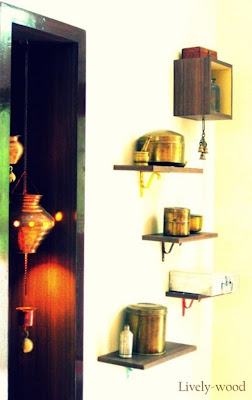
The dining had a futile cabinet pushed into the wall. We carved out a notch as per our requirement and sealed the rest. I wondered what I could do here since I wanted this place to look unique. This family had abundant old copper and brass urns and tins. They were keen on getting rid of them since storage was becoming difficult. I was increasingly happy to see them and asked if I could use them which meant drilling holes and converting them into lamps. So the urns became lights which hung gracefully with copper chains and got adorned by traditional brass bells. A mellow light inside them looked dazzling and romantic.


The dining area was not yet done. In the excitement of all these beautiful embellishments, I pleaded them to dig out more things which they didn't remember they had. Then slowly more and more antiques surfaced. They had forgotten most of it and almost did not believe what they inherited. So the junk according to them became a huge part of their décor. I arranged shelves abstractly and set all the
antiques perfectly on these platforms completing the look of the dining area. We also converted a water container and a traditional water heater into side tables which became a part of this room. As far as I think, this is the best part in the house!
I could not neglect the living space which of course was the first place when you entered the house. Again, the family was ready to replace their bulky sofa with something trendier. It took me a while to convince them about retaining this piece because it was made with the finest teak wood which is impossible to procure today. I promised them to
refurbish it so that they don’t get bored with it anymore. Later after some work was done on it, we realized we have saved a lot of wood from the remains on the sofa. The best part was, this wood was used in every bit of the furniture that was made new, like the coffee table and divider. Let me explain, this part of the living space needed the motifs of the eternal triangles to balance the dining area since it was the same extended room. We built a pretty coffee table with the wood salvaged from the hand rest of the sofas. The piece turned out to be remarkably pretty and took the attention of the living space.


The rest of the living room got converted into a simple space. An old wall cabinet became new where we displayed a beautiful sculpture of Buddha. We made a settee to make the place look cozy and keeping in mind that the family enjoys sitting low. A slider was made into the settee so that 2 people could sleep there if need be. The sofas got compact and prettier. We also converted the 2 chairs of the sofa set into stools with lower back support. This really changed the look of the living room. Two warm table lamps were placed on each side of the television set. The whole place looked cozy and welcoming.
The family wanted segregation between the dining and living space yet I had to maintain the openness. So I decided to make a
floating divider between the two. We cut rounded quadrangles and squares and secured them into each other which hung from the ceiling. Even the bar on which we hung the divider was salvaged from the sofa! Every bit of the remains of the sofa made its way through various things in the house.
Lastly, I had to give my last bit of finishing touches. These came in by attending to the walls of the living space. So, with our remaining wood we decided to glue it, paint it and make it into something cool and special which would suit this space perfectly. Keeping the theme of triangles and quadrangles with fresh blue and tomato red toning it down with whites and browns, we completed this work just in time for the arrival of the Ganesh festival.


Hey keep posting such good and meaningful articles.
ReplyDelete